Friday, October 10, 2014

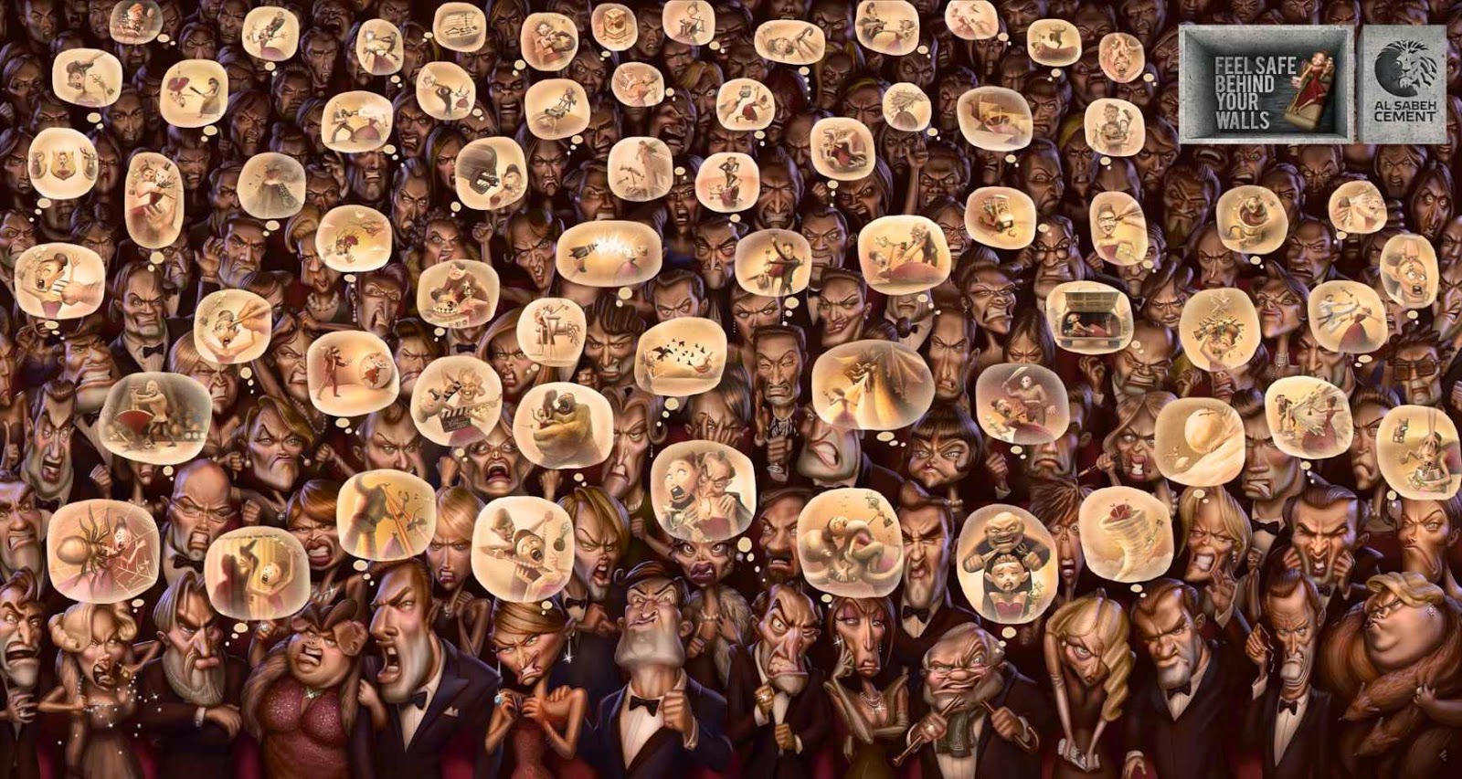
"Feel Safe Behind Your Walls" Al Sabeh Cement of Lebanon

Cimenterie Nationale began mixing cement in Northern Lebanon in 1953 and gradually developed a larger family of brands. According to their website,
Today, our team of 550 highly trained and experienced personnel is committed to the production of high quality cement products under the well-known ‘Al Sabeh Cement’ (Lion) brand, which continuously meets stringent national and international standards. Quality and a commitment to preserving the environment are integral aspects of all our operations, which is highlighted by our ISO certifications and various other awards. 

The commissioned ads from Impact BBDO of Dubai, UAE to be used in Lebanon.

I like the ads, but the message is that everyone is crazy and after you, so you should hole up in your house made of cement. The tagline is "Feel safe behind your walls." The ads make me think that this cement is only for movie stars, soccer (futbol) players and politicians. But that's obviously not the case. 

Cement is also not something that we usually think about in the U.S., so for me, I was thinking, geez why would so much effort go into three ads. There are so many characters in each of these. I like the three different versions as well. Each of the characters has personality, to the point that we could give them all names.

Each ad has it's own feel but because of the logo in the top right hand corner and the repetition that each exhibits by having so many characters, you can tell that they are part of the same campaign. Politician Discourse reminded me of the movie 'Up!' or 'Meet the Robinsons' whereas Referee made me think of 'Dragon Ball Z' and 'Pokemón'. And then Actress of the Year was reminiscent of Coraline.

Politician Discourse

Referee 

Best Actress of the Year 


Monday, September 29, 2014

So Strong. So Soothing. So Smooth: Lineage Coffee of South Africa

Craig Charity is the man of the day. At least in my book.

Photo: lineagecoffee.com
Photo: DailyFix.co.za
While it's #NationalCoffeeDay here in the USA, and we get all kinds of freebies (See USA Today's list here), I thought I could highlight an awesome barista in South Africa - let's make this #InternationalCoffeeDay

On dailyfix.com in March, Charity said:
‘I want to open people’s mind’s and taste buds to experiential coffee rather than just keep-me-awake coffee. My demonstrations will focus on creating specialty coffees and I’m hoping to create real Alice in Wonderland experience with tastes no-one’s tried before.’
The ads for Lineage coffee give off that Alice in Wonderland feel as well. I think that they match the personality of the #1 Barista in South Africa for 2014.

So soothing
So strong
So smooth
Are the ads effective?

It may be helpful to note that they are postcards.

I think yes.

Whimsical. The font chosen matches the way that the models feel. And make no mistake: You can see very clearly in the corner that the ad is for Lineage Coffee.

The ads are fun and quirky. I would definitely read the back of one if I received one. And if I ever go to South Africa, I plan to hit up Lineage Coffee

So yes. In honor of #InternationalCoffeeDay , Charity, you win.

Great ads. Clever. Now, Charity, you better mail me one :)

Happy Monday!

Friday, September 19, 2014

Bloody Hell: This would never work in the US.


And that's why.

With Breast Cancer Awareness Month right around the corner, I figured I could do something about this awesome organization called CoppaFeel! It's a registered charity in England and Wales.

Nudity is completely unacceptable for advertisements in the United States. It would be shut down within moments. And that is so unfortunate as this organization is awesome and every woman should sign up!


This non-profit, much like America's Susan G. Komen Foundation, is just a little more racy, when it comes to its ads. But I think they are pretty effective. You can sign up to be reminded to CoppaFeel! and it's pretty easy. Click the photo!


I've got Kiera and Knightly all signed up and ready to be copped monthly! And I hope you take a second to do the same.

Now more about the ads:

They're so effective because they beg for women to participate and they definitely garner attention. The participation is key. The organization just wants you to remember to feel your breasts monthly for lumps and they want you to be able to describe your breasts in a way that makes you think differently about them. And I think the ads drive people to do that!

They also have a pretty effective social marketing campaign going on as well. Check out #whatnormalfeelslike on Twitter!


So now: Did these ads make you want to CoppaFeel!?


Friday, August 29, 2014

I'm back!

Hello friends!

I am extremely thrilled to announce that I am back in the saddle with Ads Across the Globe. This blog began in part because I typically watch the advertisements on the television or try to pick out product placement in shows, rather than watch the shows themselves... And partly because I received class credit for it in an undergraduate Global Studies class.

I left because the class was over.
I never lost my love for thought provoking ads, in fact I have a cache of them waiting for you!
And I am now back because I'm getting class credit again.
Because in real life: Money = blog posts.

This time, it's for a graduate social media class!

-- AND NOW FOR MY SECOND FIRST POST YAY  --

Since I have been gone for so long, I thought that I would start back full steam ahead. I want to discuss two topics with you today. First, the idea that advertisements are called adverts in England/Great Britain. And second, let's bring up one of the BEST ads ever. And by best, I really mean controversial. Scandalous. Even a little bit jarring... Let me get your blood pumping a bit, if you will.

Photo: Google search for "advert"
Photo: Google search for "advertisement"
I love this! Ads are called "adverts" in Great Britain. See on the left. Even google says so.

The basic principle of an advertisement is to advert your attention, to capture your attention, from one subject to another, hopefully relevant subject... that is, if the ad exec did his or her job right,

The definition to the left, according to google, includes four topics for advertisements:

  1. product
  2. service
  3. event
  4. job vacancy
What are other things that you have seen "adverts" display? I think that those 4 pretty much sum it up for me. I don't know where I would put political candidate ads. Maybe under service?? What do you think?


Okay and now for the juicy part...


This ad is a little crazy, but just stick with me...


Photo: internetvibes.com

It's an ad for NON-ALCOHOLIC BEER

That's correct, pregnant ladies, it turns out you can have a beer with the boys.

Well my first thought was that the ad was about safe pregnancy. And then I read the side, and noticed the bottom corner. I had never heard of Nova Schin, the Brazilian lager, but then again I'm not into non-alcoholic beers lately, well ever. I don't even think that I would want a non-alcoholic beer if I was pregnant. And just off hand, that ad and pose and everything, I just really do not find that attractive. So I'm wondering who the target audience was here.

I'm a 24-year old maybe one day in the distant future potential mother.
And I'm not buying it.

Do you think that an entire board room of ad execs who planned this ad were gearing it more for men at a football game or NASCAR race? Cause that's what it's screaming to me.


Wednesday, April 13, 2011

Portuguese Sleep Association - APS Office Commercial


This ad pulls fear into the mix. Most ads play on humor or sex so it’s nice to find different ads that pull on different areas of consumers.

The words that show at the end, “Fortunately he fell asleep at the office. Driving tired can kill,” really make the viewer think.  After seeing this ad, it puts driving tired into perspective. I don’t want to know what happens if you fall asleep at the wheel so I’d say this ad was very effective. It’s a good message presented in a good way. Good work APS.

Tuesday, April 12, 2011

A glass half full of joy – Cadbury Egg Commercial


Advert = British slang for advertisement, much like the American "ad"


The ad above created lots of hype in Europe in 2008, but also in other countries such as Singapore. Featuring a drum-playing gorilla is pretty original. He seems to be pretty real until you realize that he’s going to play the drums. It definitely would catch the viewers’ attention and keep it, almost like sponsoring a sitcom. Talk about gorilla marketing... More like guerrilla marketing.


“A glass half full of joy” appears on a purple screen at the end of the show underneath a Cadbury bar of milk chocolate. It’s the only reason that you know it’s a Cadbury ad. I did some minor research on the effectiveness of the ad and actually even with all the hype around it, Cadbury didn’t sell as much chocolate. The advertisement won many awards and was the topic of conversation at countless water coolers, but according to TNS, a marketing research company, during the period of the advertisement’s run up to July 2008, Cadbury’s Dairy Milk actually lost ground to Galaxy (produced by rival Mars). See article here


This gorilla ad and the eyebrow ad below spawned many spoofs on youtube. Some were of kids imitating the eyebrow ad others of adults. There’s a gorilla ad spoof that is set to a Deep Purple song and many other versions, much like the David After Dentist spoofs. These also create a lot of hype around the ad when people start making their own versions.


In my Consumer Behavior class, we’re discussing the Elaboration Likelihood Model (ELM) and it applies to the route that the Cadbury marketers took. When ability and involvement of the consumer are high, the central route works best. Cadbury sells chocolate, not yachts, so they didn’t follow this model. They went with the Peripheral route to get their message across. This is said to work best when the consumer’s ability and/or motivation to buy are low. When using the peripheral route, persuasion is accomplished through positive peripheral cues. For example, peripheral route ads typically use attractive pictures, spokespeople, or music, there are a lot of claims made and humor to get their point across. These two Cadbury ads used humor.


I would have said that they were effective but according to TNS, Cadbury’s Dairy Milk actually lost ground. Their back up plan is probably the sleeper effect, where as the ad is forgotten, the message lingers: Buy Cadbury. The next time I’m picking between chocolate in London, I probably won’t go for Hershey’s. I’ll tell ya that much.


Sunday, April 3, 2011

The World of Diving

My room mate is taking scuba diving. She bought her $250-something worth of gear which is now pretty important to her and got a magazine out of it which became interesting to me. I was flipping through Sport Diver and found two ads that I thought would be cool to critique. The cool thing about Sport Diver is that its circulation is greater than just America. According to one of its many photographers, "Current circulation of Sport Diver Magazine is 175,000 internationally and it is the official publication of PADI, which is the world’s largest scuba diving and training certification agency."


Here are the two ads I chose:
 
  • This ad uses fantasy effectively because it makes you think that if I was in that situation, I would need at least three layers (bottom right corner) to my wet-suit. In reality, most people that own wet-suits would not go on a dive like this. They may snorkel or dive a rock quarry, but nothing this extreme unless they had the money to do so. In which case, they would probably have a more expensive suit. I think it sells the thought that the diver would be more adventurous and get to go out and do more. It sells the experience too.


    • I think this ad is effective because it applies the mask to an attractive woman. Her skin is glowing, her lips are plush and glossy and her nails are long and painted. These are all subtle clues that you can look like this woman or if you’re a man you can be with a woman who looks like this if you use this brand of goggles. Goggles are probably the most unattractive thing you can put over your eyes and this ad jazzes them up because of the sex appeal of the woman in it. For a magazine article it's also good with the text at the bottom to explain a little more about the goggles. Overall, a very effective ad.